- We have a very simple html code here. There is one div and an image of 400 x 300 under that div.
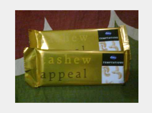
- We will do some basic styling by mentioning its width, background colour and place it in a center by using margin property. I am going to opt for #efefef as a background colour.
body {
	width:400px;
	background-color:#efefef;
	margin:100px auto;
     }
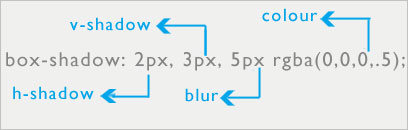
- Our next step is to give styling to the class “container” which is the main div of the code. We will apply -webkit-box-shadow property for webkit supporting browsers, -moz-box-shadow for mozilla abd box shadow. I am using 2px for horizontal shadow(h-shadow), 3px for vertical shadow(v-shadow), 5px for blur distance and rgba colour value. Some more basic properties like margin and padding and background colour to white.Now as we can see that image is slightly bigger. To fix it up we will use max-width property.
.container {
	width:400px;
	-webkit-box-shadow: 2px 3px 5px rgba(0,0,0,.5);
	-moz-box-shadow: 3px 3px 5px rgba(0,0,0,.5);
	box-shadow:3px 3px 5px rgba(0,0,0,.5);
	padding: 20px;
	margin:0 auto;
	background: white;}
.container img {
	max-width:100%;
	max-height:100%;
	border:1px solid #666;}
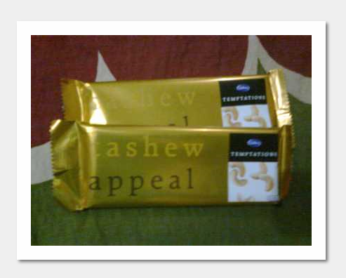
- We can give variations by using inset property to give depth at the top and left side of the image.
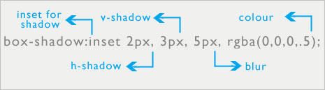
.container {
	-webkit-box-shadow:inset 2px 3px 5px rgba(0,0,0,.5);
	-moz-box-shadow:inset 2px 3px 5px rgba(0,0,0,.5);
	box-shadow:inset 2px 3px 5px rgba(0,0,0,.5);
	padding: 20px;
	margin:0 auto;
	background: white;
}
- Browser support: The box-shadow property is supported by many modern browsers including IE9+, Firefox 4, Chrome, Opera, and Safari 5.1.1.