- 2d transforms: The CSS3 transform property help web designers to give style to their html page. Now they are not dependent on images and javascript to create animated box or elements. One can easily translate, rotate, scale, or skew any element on the page and give it a fancy look.
- Browser support: All the modern browsers like Firefox, Opera and IE 10 support the transform property.Add prefix -webkit- for chrome and safari.
Add prefix -ms- for IE9.
-
- Translate: We need to specify two values in translate function. The first value is the x axis and the second value is the y axis. This property helps us to move the element in any direction without affecting the flow of the document.
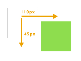
.div{ transform:translate(110px,45px); -webkit-transform:translate(110px,45px); /* Safari and Chrome */ -ms-transform:translate(110px,45px); /* TO SUPPORT INTERNET EXPLORER 9 */ background:#00CC66; width:100px; height:100px; } - Rotate: The rotate transform function helps us to rotate a div. The positive value will rotate it in a clockwise direction and the negative value will rotate it in an anti clockwise direction. Values are mentioned in degrees.
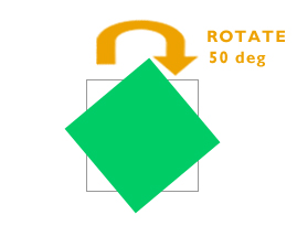
.div{ transform: rotate(50deg); -webkit-transform: rotate(50deg); /* Safari and Chrome */ -ms-transform: rotate(50deg); /* TO SUPPORT INTERNET EXPLORER 9 */ background:#00CC66; width:100px; height:100px; } - Scale: This method is used to scale an element. We can easily increase or decrease the size of an old div to the new div. The first value is the x axis and the second value is the y axis.
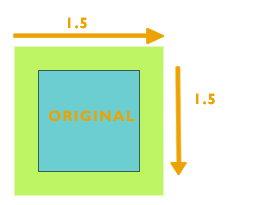
.div{ transform: scale(1.5,1.5); -webkit-transform: scale(1.5,1.5); /* Safari and Chrome */ -ms-transform: scale(1.5,1.5); /* TO SUPPORT INTERNET EXPLORER 9 */ background:#00CC66; width:100px; height:100px; } - Skew: The skew function bends the element. The first value specifies the skew on x axis and the second value specifies the skew on the y axis.
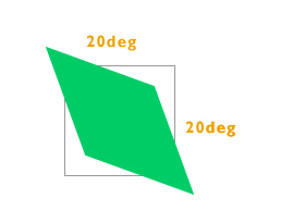
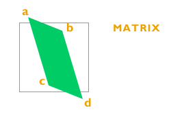
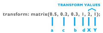
.div{ transform: skew(20deg, 20deg); -webkit-transform: skew(20deg, 20deg); /* Safari and Chrome */ -ms-transform: skew(20deg, 20deg); /* TO SUPPORT INTERNET EXPLORER 9 */ background:#00CC66; width:100px; height:100px; } - Matrix: It is the combination of all the above methods. As the name suggests, values are in the matrix format which helps us to skew, rotate, scale and transform the element.
.div{
	transform: skew(20deg, 20deg);
        -webkit-transform: skew(20deg, 20deg); /* Safari and Chrome */
        -ms-transform: skew(20deg, 20deg); /* TO SUPPORT INTERNET EXPLORER 9 */
	background:#00CC66;
	width:100px;
	height:100px;
	}
- Translate: We need to specify two values in translate function. The first value is the x axis and the second value is the y axis. This property helps us to move the element in any direction without affecting the flow of the document.

