Author Archives: Parul M

How to use CSS3 multiple columns properties

  • Multiple column As we know that text in columns is easier to read than the widespread long lines. Newspapers follow the rule of multi column layout because the lines are too long to read and understand. This property helps designers to give the look and feel of a newspaper columns with minimal coding.

    Browser support: IE 10+ and Opera.
    IE 9 and older versions doesn’t support this property.
    add -webkit- for safari and chrome.
    add -moz- for firefox.

    Lorem ipsum dolor sit amet, consectetur adipiscing elit. Integer semper nibh mauris, non consectetur justo gravida vitae. Proin sed feugiat erat. Praesent eleifend massa in tellus sagittis semper. Nulla tempor tincidunt nisl pharetra varius. Etiam vel sollicitudin quam, ac dictum dolor. Duis porta ultrices ante non aliquam. Fusce in dui quis massa laoreet posuere vitae et risus. Aenean convallis condimentum massa, eget aliquam velit.

    .multicolumn_layout
    {
    -moz-column-count:3; /*To support Firefox */
    -webkit-column-count:3; /*To support Chrome and Safari*/
    column-count:3;
    }
        
  • Column gap: Column gap property helps to provide space between the columns.
    Lorem ipsum dolor sit amet, consectetur adipiscing elit. Integer semper nibh mauris, non consectetur justo gravida vitae. Proin sed feugiat erat. Praesent eleifend massa in tellus sagittis semper. Nulla tempor tincidunt nisl pharetra varius. Etiam vel sollicitudin quam, ac dictum dolor. Duis porta ultrices ante non aliquam. Fusce in dui quis massa laoreet posuere vitae et risus. Aenean convallis condimentum massa, eget aliquam velit.
    Nulla tortor purus, accumsan in nulla in, feugiat gravida enim. Donec suscipit mi sed dui pulvinar, et imperdiet velit pretium. Nullam suscipit dictum nibh, quis ultricies sapien pulvinar quis.
    .column_gap{
    	-moz-column-count:3; /*To support Firefox */
    	-webkit-column-count:3; /*To support Chrome and Safari*/
    	column-count:3;
    	-moz-column-gap:30px; /*To support Firefox */
    	-webkit-column-gap:30px; /* To support Chrome and Safari */
    	column-gap:30px;
        }    
        
  • Column Rules: This CSS3 property helps to stylize the columns by providing width, style and color to the rule between columns. The rule will appear in between the column gap. This is the shorthand property for the column-rule-color, column-rule-style, and column-rule-width properties.
    phpmind-css3-multi-column-property

    Lorem ipsum dolor sit amet, consectetur adipiscing elit. Integer semper nibh mauris, non consectetur justo gravida vitae. Proin sed feugiat erat. Praesent eleifend massa in tellus sagittis semper. Nulla tempor tincidunt nisl pharetra varius. Etiam vel sollicitudin quam, ac dictum dolor. Duis porta ultrices ante non aliquam. Fusce in dui quis massa laoreet posuere vitae et risus. Aenean convallis condimentum massa, eget aliquam velit.
    Nulla tortor purus, accumsan in nulla in, feugiat gravida enim. Donec suscipit mi sed dui pulvinar, et imperdiet velit pretium. Nullam suscipit dictum nibh, quis ultricies sapien pulvinar quis.
       .column_rule{
    	-webkit-column-rule: 1px solid #CCCCCC; /*To support Chrome and Safari*/
    	-moz-column-rule: 1px solid #CCCCCC;/*To support Firefox */
    	column-rule: 1px solid #CCCCCC;
    	-moz-column-count:3; /*To support Firefox */
    	-webkit-column-count:3; /*To support Chrome and Safari*/
    	column-count:3;
    	}
       
  • Column width: Column width helps to declare the width of the column. Here it works similar to min-width property.

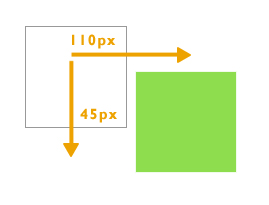
    For example: If our element’s width is 400px.The column gap is 20px and column width is 140px.
    400px – 20px =380px/140px = 2.7
    The browser can fit 2 columns by utilizing the space provided even if the column count is 3, as there is not enough space for a third column.

    Lorem ipsum dolor sit amet, consectetur adipiscing elit. Integer semper nibh mauris, non consectetur justo gravida vitae. Proin sed feugiat erat. Praesent eleifend massa in tellus sagittis semper. Nulla tempor tincidunt nisl pharetra varius. Etiam vel sollicitudin quam, ac dictum dolor. Duis porta ultrices ante non aliquam. Fusce in dui quis massa laoreet posuere vitae et risus. Aenean convallis condimentum massa, eget aliquam velit.
        .column_width{
    	column-width:140px;
    	-moz-column-width:140px; /*To support Firefox */
    	-webkit-column-width:140px; /*To support Safari and Chrome */
    	}
        
  • Column: This property is used to declare the number of columns and their width.
    phpmind-css3-multi-columns-property-eg

    Lorem ipsum dolor sit amet, consectetur adipiscing elit. Integer semper nibh mauris, non consectetur justo gravida vitae. Proin sed feugiat erat. Praesent eleifend massa in tellus sagittis semper. Nulla tempor tincidunt nisl pharetra varius. Etiam vel sollicitudin quam, ac dictum dolor. Duis porta ultrices ante non aliquam. Fusce in dui quis massa laoreet posuere vitae et risus. Aenean convallis condimentum massa, eget aliquam velit.
        .column_property{
    	columns:120px 3;
    	-webkit-columns:120px 3; /*To support Safari and Chrome */
    	-moz-columns:120px 3; /*To support Firefox */
    	border: 1px solid #d8d8d8;
    }
        
Share

Synchronous and Asynchronous

JavaScript itself is synchronous and single-threaded language. but you can write code in such a manner that function execution take a long time and can be interleaved with other operations.

First, let us use an analogy to understand Synchronous and Asynchronous.

Synchronous – You are in a Bus stop. When bus arrived, people will enter in a bus one by one. You cannot get into the bus until everybody in front of you gets in. and the same concept applies to the people standing behind you. This is Synchronous.

Executing something synchronously means, you wait for the task to finish before moving on to another task. Or we can say, two synchronous threads must be aware of one another, and one must execute in some way that is dependent on the other.

Asynchronous – Take household chores as an example. You put clothes to get washed and dry in a washer and dryer. Then you bake pizza in a oven. Meanwhile you are cutting veggies for salad. In this situation, couple of tasks are getting done at the same time. When the task is done. It will simply report back. This is asynchronous.

Executing something asynchronously means, you can move on to another task without waiting for the first task to get finished. The result of each task will be handled once the result is available. Or in other words, Asynchronous means two threads are totally independent, run parallely and neither one comes in each other way at the time of execution.

Try this code

// synchronous
console.log('First Task');
console.log('Second Task');
console.log('Third Task');

Output will be :-

First Task
Second Task
Third Task

The output will be First Task, Second Task, Third Task. As javascript execute one function at a time and will wait for the function to be done before moving to the “Second Task”

Now try this code. I am using setTimeOut method here. The function will be processed in the background, while your program is doing other things.

// asynchronous
console.log('First Task');
setTimeout(function(){
   console.log('Second Task');
}, 2000); 

console.log('Third Task');

Output will be :-

First Task
Third Task
Second Task

The setTimeout() method calls a function or evaluates an expression after a specified number of milliseconds. The setTimeout() method is asynchronous as it breaks the synchronous flow. This trick is used to execute the code after stacked events and fix timing-related problems.

AJAX (Asynchronous JavaScript and XML) requests are by default asynchronous, The XMLHttpRequest object is used to exchange data with a server behind the scenes. When the browser makes server requests. The response could take a little time. So you set up a function that will wait for the response to be sent back by the server, and react to it once the response is available. This whole process does not comes in the way of other functions.

  var xhttp;
      if (window.XMLHttpRequest) {
        // code for modern browsers
        xhttp = new XMLHttpRequest();
      } else {
        // code for old browsers (IE6, IE5)
        xhttp = new ActiveXObject("Microsoft.XMLHTTP");
      }
      xhttp.onreadystatechange = function() {
        if (this.readyState == 4 && this.status == 200) {
          document.getElementById("ajax_demo").innerHTML = this.responseText;
        }
      };
      xhttp.open("GET", "fruits.txt", true);
      xhttp.send();
      xhttp.onload = function(){
        document.write(this.response);
      }; 
Share

Understanding Javascript Closure

Closure is a nested function that has access to the variables in the outer (enclosing) function’s scope chain. It has access to variables in three scopes:

  • Variable in its own scope.
  • Variables in the enclosing (outer) function’s scope.
  • Global variables.

var globalVariable = 'Global variable.';

function outerFunction() {
  var outerFunctionVariable = 'Outer function variable.';
  
  function innerFunction () {
    var innerFunctionVariable = 'Inner function variable.';
    console.log("This is " + innerFunctionVariable);
    console.log("I can also access " + outerFunctionVariable);
    console.log("This is a " + globalVariable);
  };
  innerFunction();
};
outerFunction();

Best part of closure is that the nested (inner) function can access the variables from the outer scope even after the outer function has returned.

function myFunction(x) {
    var outerVariable = x;
    return function() {
        console.log(outerVariable);
    };
};

var secondFunction = myFunction("This is outer variable");
secondFunction();
Share

Understanding delete operator in Javascript

Delete operator is used to delete the property of an object. It completely remove the property and keep the rest of the object intact.

  • The delete operator will not delete ordinary variables.
  • It cannot delete properties of the global object, which were declared with the var keyword.
  • However, it will delete “global variables,” which were not declared with var keyword. since they are actually properties of the global object ( window in the browser).
  • The delete operator doesn’t delete prototype property.

For examples:

var person = { rank : 1};
var result = (function(){
    delete person.rank;
    return person.rank;
  })();
  console.log(result); // undefined

The result would be undefined. In the above code, we have an object named as “person” which has the property “rank”, and as it is a self-invoking function, we will delete the “rank” property from object “person”. When we console.log the reference of the property the result will be undefined.

Let us go through some examples where delete operator doesn’t work:

var result = (function(number){
    delete number;
    return number;
  })(5);  
  console.log(result); // 5

The result would be 5. Delete operators don’t affect local variables. Here, “number” is not an object but a local variable. The delete operator will not delete ordinary variables.

 var number = 5;
var result = (function(){
    delete number;
    return number;
  })();
  console.log(result); // 5

The result would be 5. Delete operators don’t affect global variables declared with var keyword. Here, “number” is not an object but a global variable of type number.

 number = 5; // var is not used. hence it is a property of window.
delete window.number;
console.log(number); // ReferenceError: number is not defined

The result would be “number is not defined”. Here, the global variable “number” is not defined with var keyword. hence, the delete operator will delete “number” since they are actually properties of the global object (window in the browser).

var team = {
  name: 'Jane'
};
var team2 = Object.create(team);
delete team2.name;
console.log(team2.name); // Jane

The result would be “Jane”. Delete operator will not affect prototype property. Here, “name” is a prototype property of team2.

Share

How to use CSS3 2d property?

  • 2d transforms: The CSS3 transform property help web designers to give style to their html page. Now they are not dependent on images and javascript to create animated box or elements. One can easily translate, rotate, scale, or skew any element on the page and give it a fancy look.
  • Browser support: All the modern browsers like Firefox, Opera and IE 10 support the transform property.Add prefix -webkit- for chrome and safari.

    Add prefix -ms- for IE9.

    1. Translate: We need to specify two values in translate function. The first value is the x axis and the second value is the y axis. This property helps us to move the element in any direction without affecting the flow of the document.
      phpmind_translate_eg

      .div{
      	transform:translate(110px,45px);
              -webkit-transform:translate(110px,45px); /* Safari and Chrome */
              -ms-transform:translate(110px,45px); /* TO SUPPORT INTERNET EXPLORER 9 */	
      	background:#00CC66;
      	width:100px;
      	height:100px;
      	}
    2. Rotate: The rotate transform function helps us to rotate a div. The positive value will rotate it in a clockwise direction and the negative value will rotate it in an anti clockwise direction. Values are mentioned in degrees.
      phpmind_rotate_eg

      .div{
      	transform: rotate(50deg);
              -webkit-transform: rotate(50deg); /* Safari and Chrome */
              -ms-transform: rotate(50deg); /* TO SUPPORT INTERNET EXPLORER 9 */	
      	background:#00CC66;
      	width:100px;
      	height:100px;
      	}
    3. Scale: This method is used to scale an element. We can easily increase or decrease the size of an old div to the new div. The first value is the x axis and the second value is the y axis.
      phpmind_scale_eg

      .div{
      	transform: scale(1.5,1.5);
              -webkit-transform: scale(1.5,1.5); /* Safari and Chrome */
              -ms-transform: scale(1.5,1.5); /* TO SUPPORT INTERNET EXPLORER 9 */	
      	background:#00CC66;
      	width:100px;
      	height:100px;
      	}
    4. Skew: The skew function bends the element. The first value specifies the skew on x axis and the second value specifies the skew on the y axis.
      phpmind_skew_eg

      .div{
      	transform: skew(20deg, 20deg);
              -webkit-transform: skew(20deg, 20deg); /* Safari and Chrome */
              -ms-transform: skew(20deg, 20deg); /* TO SUPPORT INTERNET EXPLORER 9 */	
      	background:#00CC66;
      	width:100px;
      	height:100px;
      	}
    5. Matrix: It is the combination of all the above methods. As the name suggests, values are in the matrix format which helps us to skew, rotate, scale and transform the element.
      phpmind_matrix_eg
      phpmind_matrix_eg_I

      .div{
      	transform: skew(20deg, 20deg);
              -webkit-transform: skew(20deg, 20deg); /* Safari and Chrome */
              -ms-transform: skew(20deg, 20deg); /* TO SUPPORT INTERNET EXPLORER 9 */	
      	background:#00CC66;
      	width:100px;
      	height:100px;
      	}
Share

How to use CSS3 background properties?

  • CSS3 introduces two new background properties-
    1. background-size
    2. background-origin
  • background-size: This property allows web designers to play with background images. Images can be squashed or stretched easily with the help of this property or in other words it is used to resize the background images. Earlier background images were used to appear on the browser in its actual size.
    1. contain: The Image is resized so it fits the container or we can say that the image is resized in such a way that its width and height(the bigger one) will not exceed the container’s dimensions. Note: original size of the image is 400px x 400px.
            .div{
                 background:url(phpmind-background-size-image.jpg);
      	   background-size: contain;
      	   background-repeat:no-repeat;
      	   width: 600px;
                 height:300px;
      	   border:1px solid #999;
                 }
    2. cover: The keyword “cover” is also accepted by the background-size property. The image is resized in such a way that either its width and height (the smaller one) covers the whole container but the image could be cropped if the image has a different aspect ratio.
                 .div{
      		background:url(phpmind-background-size-image.jpg);
      		background-size: cover;
      		background-repeat:no-repeat;
      		width:	600px;
      		height:300px;
      		border:1px solid #999;
      		}
    3. length: It helps us to define the width and height of the background image. The first value represents the width of the image and the second value represent the height. If only one value is mentioned then it is assumed as a width and height is set to “auto”.
                  .div{
                 	background:url(phpmind-background-size-image.jpg);
      		background-size:200px;
      		background-repeat:no-repeat;
      		width:	500px;
      		height:300px;
      		border:1px solid #999;
               	}
    4. percentage: If the value is given in percentage then the size of the background image is relative to the parent element. The first value represents the width of the image and the second value represent the height. If only one value is mentioned then it is assumed as a width and height is set to “auto”.eg: If the width and height of the background-size is set to 80% 50% respectively then the image will cover 80% width and 50% height of the parent element.
                  .div{
                 	background:url(phpmind-background-size-image.jpg);
      		background-size:80% 50%;
      		background-repeat:no-repeat;
      		width:	500px;
      		height:300px;
      		border:1px solid #999;
               	 }

    Browser support: Firefox 4+, Safari 5+, IE9+, Chrome, and Opera.

  • background-origin:  The Background-origin property allow web designers to determine the background position area in other words it helps us to know that the background position property will be positioned relative to the “content box”, “border box”, or the “padding box”.
    1. content-box:  The background image will be placed under the content div or It is relative to the content box.
                  .div{
                 	background:url(phpmind-background-origin.jpg);
      		background-origin: content-box;
      		background-repeat: no-repeat;
      		width:	300px;
      		height:300px;
      		padding:20px;
      		border:10px dotted #39C;
               	   }
    2. padding-box:  The background image position is relative to the defined padding. The background image will cover the padding area also.
                  .div{
                 	background:url(phpmind-background-origin.jpg);
      		background-origin: padding-box;
      		background-repeat: no-repeat;
      		width:	300px;
      		height:300px;
      		padding:20px;
      		border:10px dotted #39C;
               	   }
    3. border-box:  The background image position is relative to the border of the element.
                  .div{
                       background:url(phpmind-background-origin.jpg);
      	         background-origin: border-box;
      		background-repeat: no-repeat;
      		width:	300px;
      		height:300px;
      		padding:20px;
      		border:10px dotted #39C;
               	   }

    Browser support: Firefox 4+, Safari 5+, IE9+, Chrome, and Opera.

  • Background clip: The background-clip property specifies whether the backgrounds of an element extends into the border or not.
                .div{
                     background:#9CC;
    		background-clip: content-box;/*padding-box, border-box or content-box as per need*/
    		background-repeat: no-repeat;
    		width:	100px;
    		height:100px;
    		padding:20px;
    		border:10px dotted #39C;
    		float:left;
             	}


    content box

    padding box

    border box


    Browser support: Firefox, IE9+, Chrome, Opera and Safari.

Share

How to use CSS3 text shadow property ?

  • CSS3 introduces two new text properties-
    1. text-shadow
    2. word-wrap
  • text-shadow: This property gives designers and css coders a tool to give multiple text effects. Earlier which could only be done by giving effects to an image. There are various advantages of this property.Browser support: text shadow property is supported by all modern browsers except IE9.
         p{
         	font-family:Verdana, Geneva, sans-serif;
    		font-size:24px;
    		font-weight:bold;
    		color:#006600;
    		text-align:justify;
    		text-shadow: 4px 4px 7px #009900;
      	   }
    WELCOME
    TO
    WWW.PHPMIND.COM
  • word-wrap: This property helps us to split the words in the middle if it is too long and cross the borders of the parent element.Browser support: word-wrap property is supported by all modern browsers
         div{
         	 background:#EFEFEF;
             border: 1px solid #999999;
             color: #333333;
             padding: 10px;
             width: 200px;
             word-wrap: break-word;
      	 }


    This word is very longgggggggggggggggggggggggggggggggggggggggggggggggggg to fit in a div. We can break it by using word-wrap property.

Share

How to use CSS3 border properties ?

  • CSS3 border property helps us to create rounded corners, allow us to give shadow to an element and images to a border.  In short it helps us to design a stylish container for our content.
  • In this tutorial we will discuss the following border properties:
    1. border-radius
    2. box-shadow
    3. border-image
  • border-radius: This property allows web designers to create rounded corners for the divs.
  •    		div{
    			border:3px solid #666666;
    			padding:10px auto; 
    			background:#73C22D;
    			width:350px;
    			border-radius:30px;
    			}
  • Browser support: This property is compatible with all modern browsers. But to maintain compatibility with old browser it is suggested to add prefix -moz- for mozilla, -webkit- for safari.and -o- for opera.
  • box-shadow: This property allows web designers to attach a shadow to an element.
    1. The first value represents the horizontal offset of the shadow (x-axis). If the value is positive the shadow is drawn to the right side of the element, If negative the shadow is drawn to the left of the element.
    2. The second value represents the vertical offset of the shadow (y-axis). If the value is positive the shadow is drawn below the element, if negative it is drawn above.
    3. The third value (optional) represents the blur radius. This value defines how big and how much blurred the shadow is. The larger the value, the more the shadow’s edge is blurred. Negative values are not allowed.
    4. The fourth value (optional) represents the spread distance of the shadow. Positive value expands the shadow in all directions while a negative value shrink the shadow.
    5. This value (optional) allows designers to set the color of an element.
    6. The keyword inset (optional) is used to define the outer and inner box-shadows.
  •    		div{
    			border:3px solid #a1a1a1;
    			padding:10px auto; 
    			background:#ccc;
    			width:350px;
    			box-shadow: 5px 5px 8px 10px #666666 inset;
    			}
  • box-shadow: 10px 10px 5px 5px #666666;
  •  
  • box-shadow: 10px 10px 15px 5px #666666 inset;
  • Browser support: IE9+, Firefox 4, Chrome, Opera, and Safari 5.1.1.

    This property is compatible with all modern browsers. But to maintain compatibility with old browser it is suggested to add prefix -moz- for mozilla, -webkit- for safari.and -o- for opera.

  • border-image: With the help of this property images can be assigned to a border based on a single image file.
  • border-image: url(phpmind-border-image-eg.png) 30 30 round;
  •    		div{
    			background: #FF6;
    			padding: 10px 5px;
    			width: 450px;
    			border:20px solid transparent;
    			border-image: url(phpmind-border-image-eg.png) 30 30 round;
    			}
  • Image which is used
  • phpmind-border-image-eg
  • Browser support: Firefox, Chrome, and Safari 6. Use -webkit- as a prefix while working on safari 5 or its older versions. -o- as a prefix while working on opera.
Share

How to create 3D image by using multiple text shadows?

    • This property give designers and css coders a tool to give multiple text effects. Earlier which could only be done by giving effects to an image. There are various advantages of this property.
      1. As Text in an image is not searchable by search engines.
      2. CSS file size is very small in comparison to an image.
      3. Easy to update.
    • Final result

www.phpmind.com

  • Very simple and easy to use code which gives 3D look to your text.
  •     text-shadow: 0 1px 0 #3cc4fc,
                   0 2px 0  #4fcbfe,
                   0 2px 0 #5dd0ff,
                   0 3px 0 #6bd3fe,
                   0 4px 0 #78d5fc,
                   0 4px 1px rgba(0,0,0,.1),
                   0 0 5px rgba(0,0,0,.1),
                   0 1px 3px rgba(0,0,0,.3),
                   0 3px 5px rgba(0,0,0,.2),
                   0 5px 10px rgba(0,0,0,.25),
                   0 10px 10px rgba(0,0,0,.2),
                   0 20px 20px rgba(0,0,0,.15);
    }
  • Browser support: The text-shadow rule is supported by many modern browsers including IE10.
Share

How to use box-shadow property in CSS3 ?

Image0111

  • We have a very simple html code here. There is one div and an image of 400 x 300 under that div.
  • We will do some basic styling by mentioning its width, background colour and place it in a center by using margin property. I am going to opt for #efefef as a background colour.
    body {	
    	width:400px;
    	background-color:#efefef;
    	margin:100px auto;
         }

    shadow-1

  • Our next step is to give styling to the class “container” which is the main div of the code. We will apply -webkit-box-shadow property for webkit supporting browsers, -moz-box-shadow for mozilla abd box shadow. I am using 2px for horizontal shadow(h-shadow), 3px for vertical shadow(v-shadow), 5px for blur distance and rgba colour value. Some more basic properties like margin and padding and background colour to white.Now as we can see that image is slightly bigger.  To fix it up we will use max-width property.

    shadow-eg

    .container {
    	width:400px;
    	-webkit-box-shadow: 2px 3px 5px rgba(0,0,0,.5);
    	-moz-box-shadow: 3px 3px 5px rgba(0,0,0,.5);
    	box-shadow:3px 3px 5px rgba(0,0,0,.5);
    	padding: 20px;
    	margin:0 auto;
    	background: white;}
    .container img {	
    	max-width:100%;
    	max-height:100%;
    	border:1px solid #666;}

    shadow-2

  • We can give variations by using inset property to give depth at the top and left side of the image.


    shadow-eg1

    shadow-3

    .container {
    	-webkit-box-shadow:inset 2px 3px 5px rgba(0,0,0,.5);
    	-moz-box-shadow:inset 2px 3px 5px rgba(0,0,0,.5);
    	box-shadow:inset 2px 3px 5px rgba(0,0,0,.5);
    	padding: 20px;
    	margin:0 auto;
    	background: white;
    }
  • Browser support: The box-shadow property is supported by many modern browsers including IE9+, Firefox 4, Chrome, Opera, and Safari 5.1.1.
Share